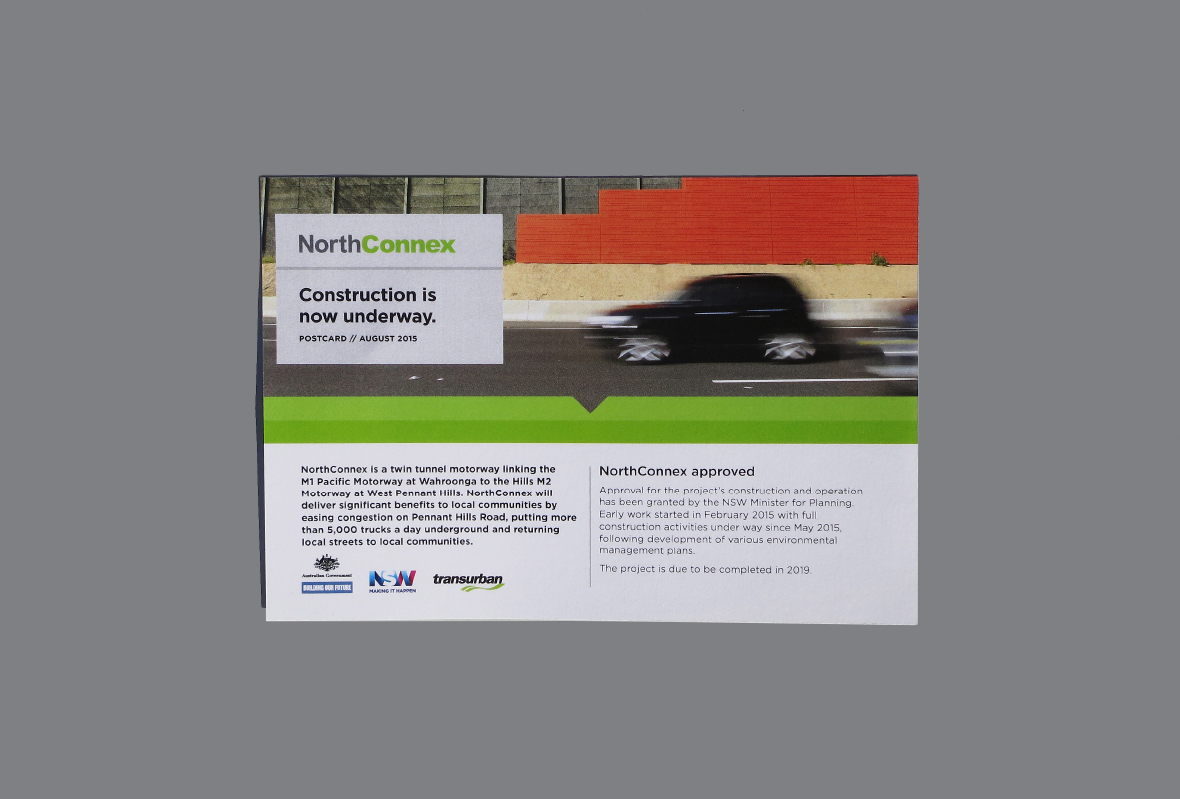
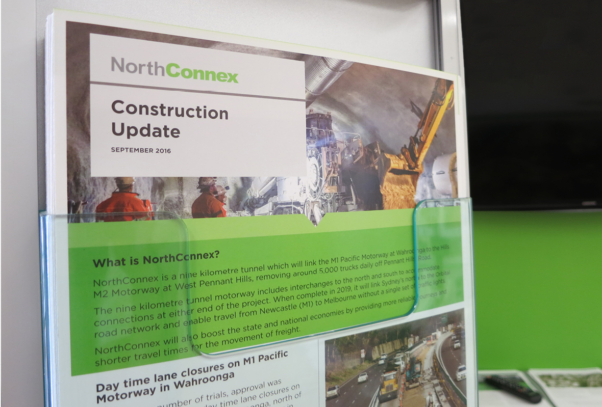
Announced as a major roadworks project in 2014, the NorthConnex tunnel in northwestern Sydney is the innovative answer to getting 5,000 trucks off local roads each week. The tunnel completes an almost-unbroken 1,000-kilometre freight corridor between Melbourne and Newcastle. However, its existing communications materials gave little sense of that excitement.
Returning Local Streets To Local Communities
Read more
Work on NorthConnex was proceeding smoothly ahead of the 2020 opening, and its directors wanted to enhance the visual identity to reach a sophisticated audience base. The objective was to build up the project’s associations with innovation and positive change, shaping a smoother path to user uptake when it opened.
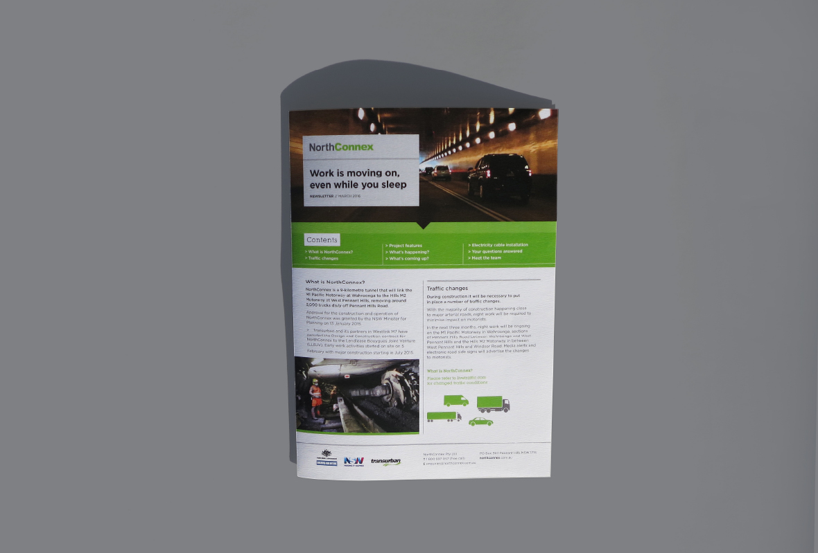
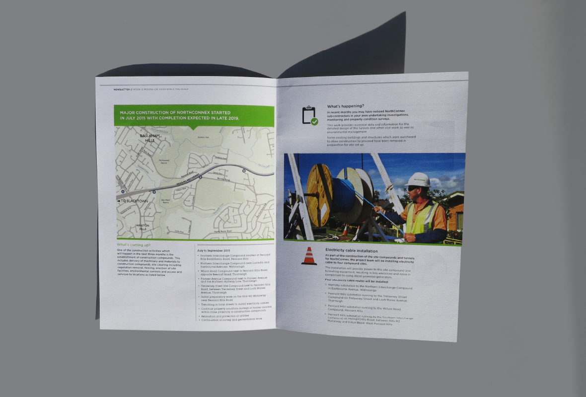
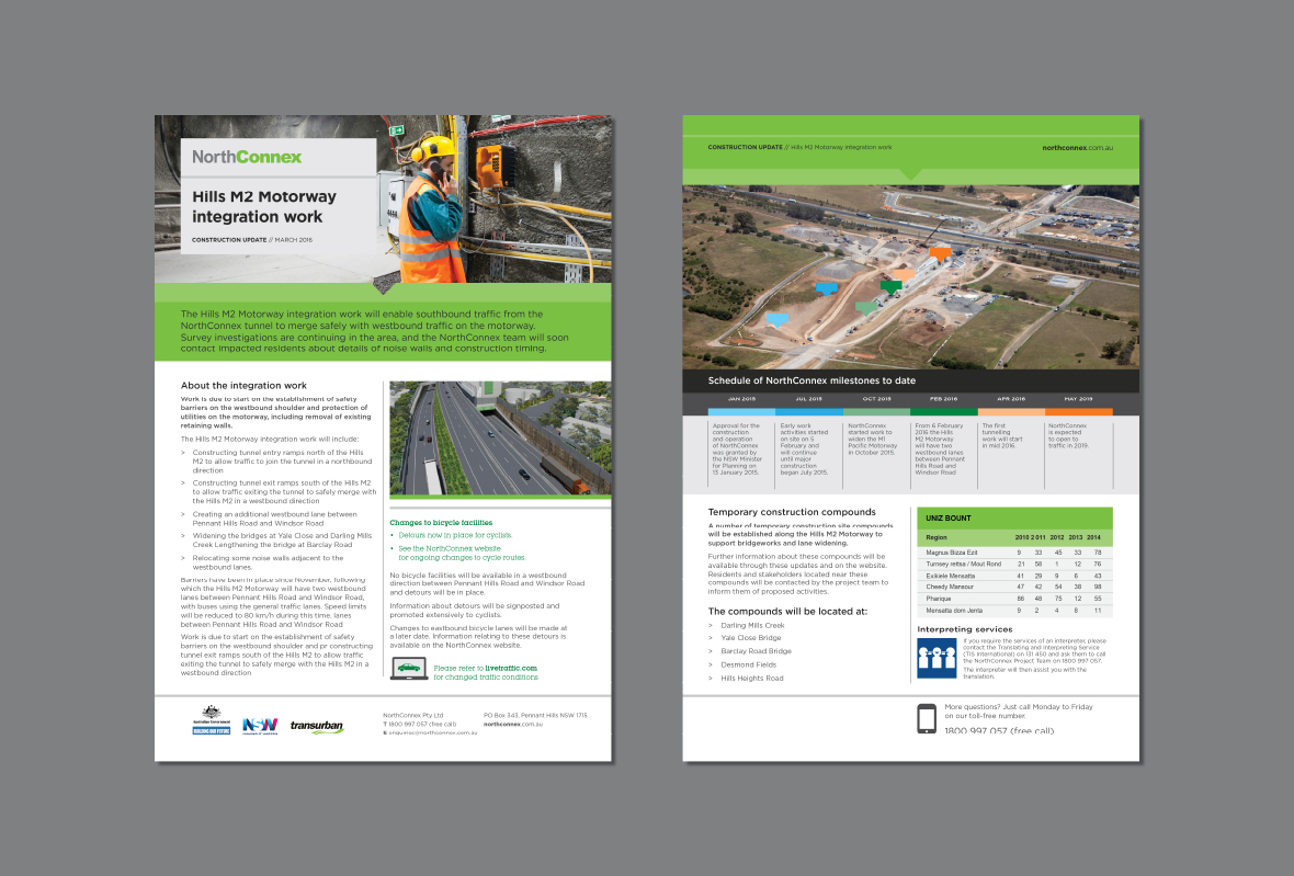
We consulted with NorthConnex’s key stakeholders first, to determine which visual elements had to remain (that would be the government-designed logo), and where there was room for change. The work also had to acknowledge the brand values of its key stakeholders, the NSW Government and Transurban.
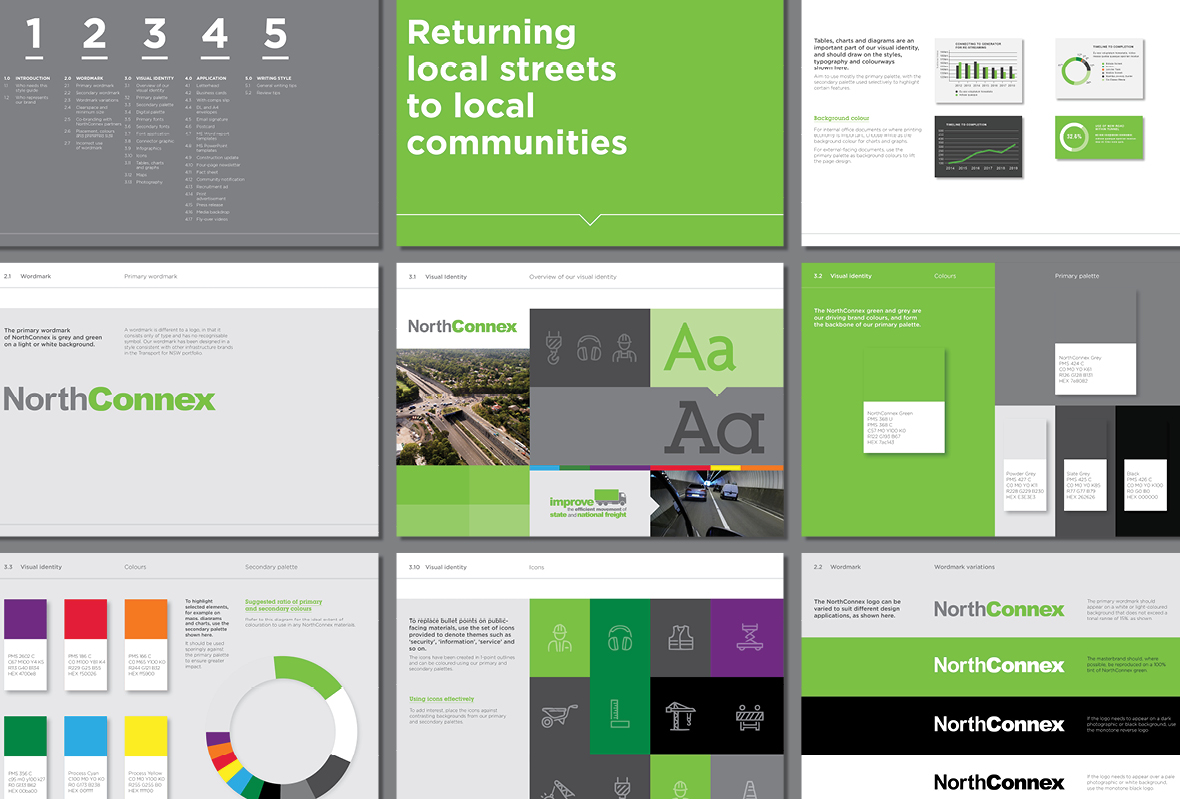
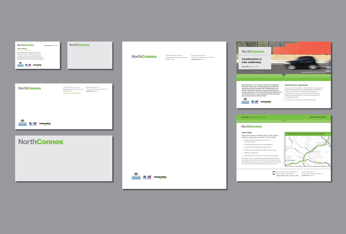
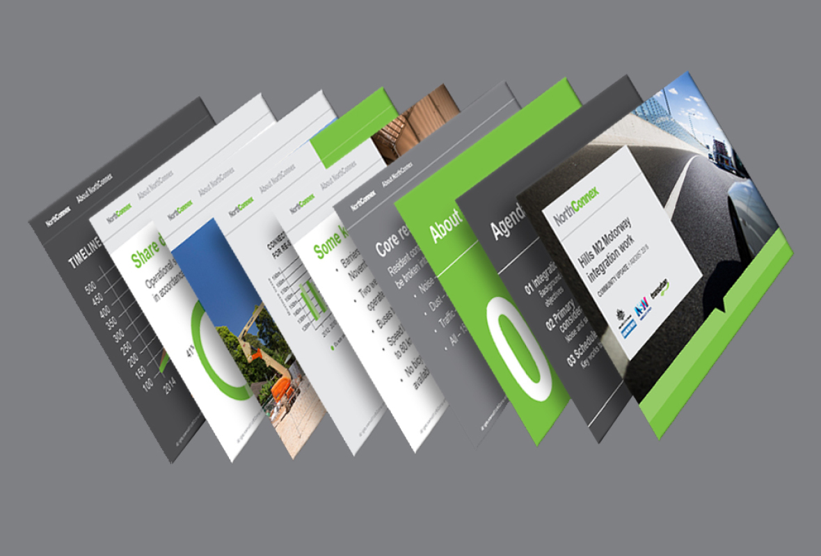
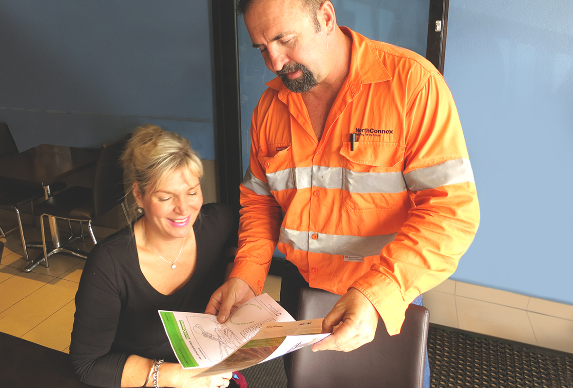
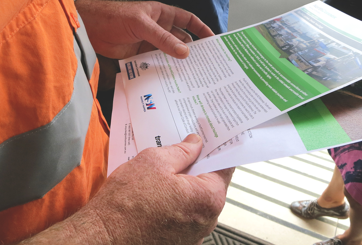
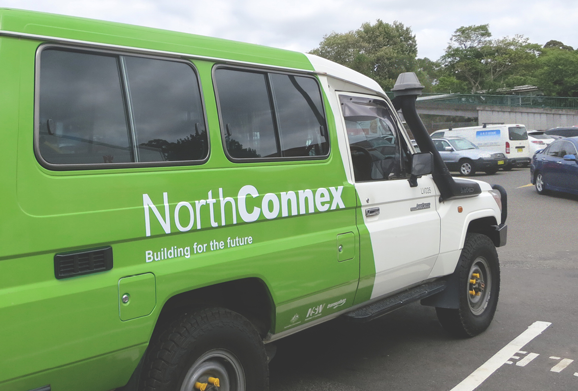
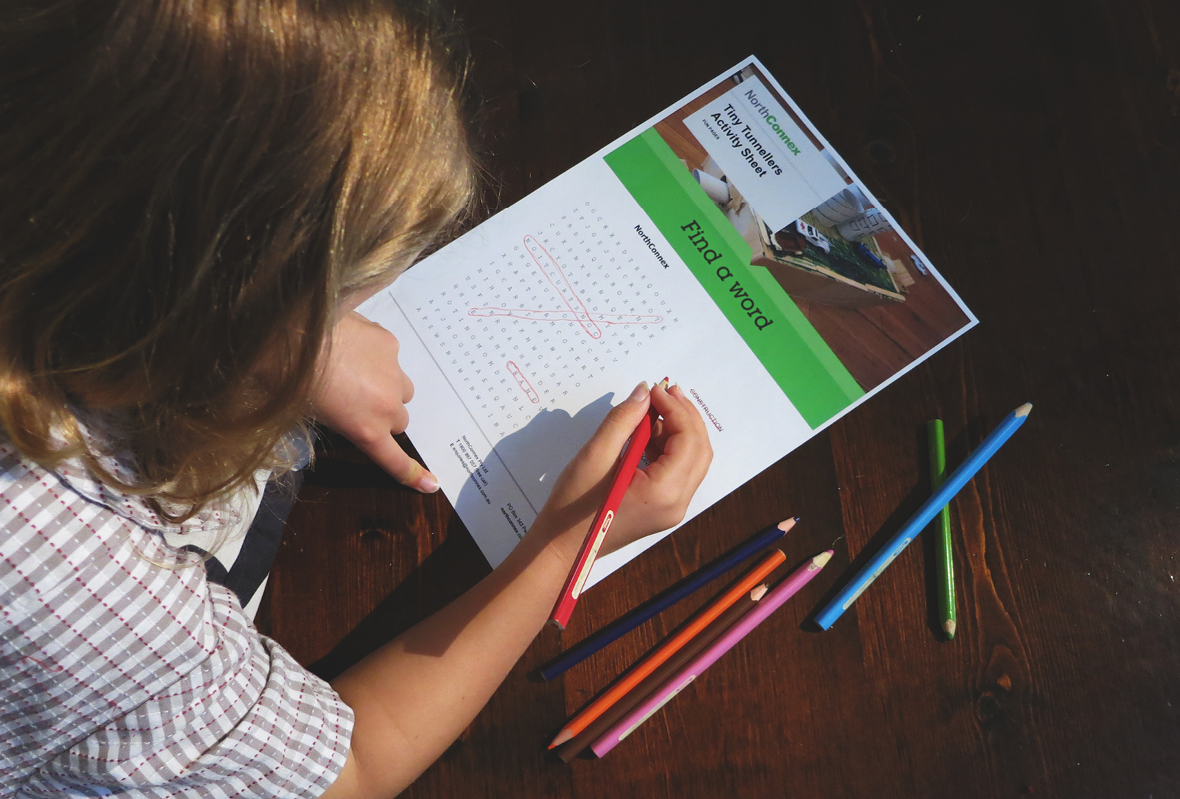
The result is a modern and modular set of graphics, rolled out across dozens of new communications materials. The work is formalised within a 60-page guideline that sets out a clear, consistent style across NorthConnex’s internal and public-facing print and digital communications.
“The work The Offices has done in presenting a clear and professional suite of collateral for NorthConnex has supported our strategy of best practice community engagement. Their design approach provides a great platform for us to communicate with more than 24,000 households and numerous stakeholder groups, across print, digital and outdoor media.”
– Gina Kelly, Director Stakeholder Engagement, NorthConnex