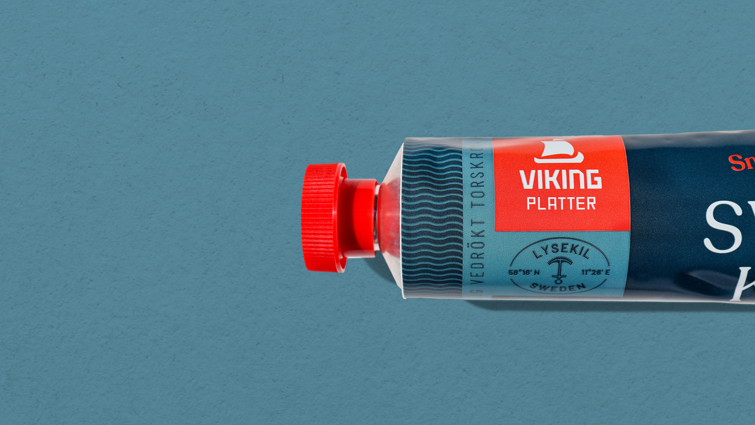
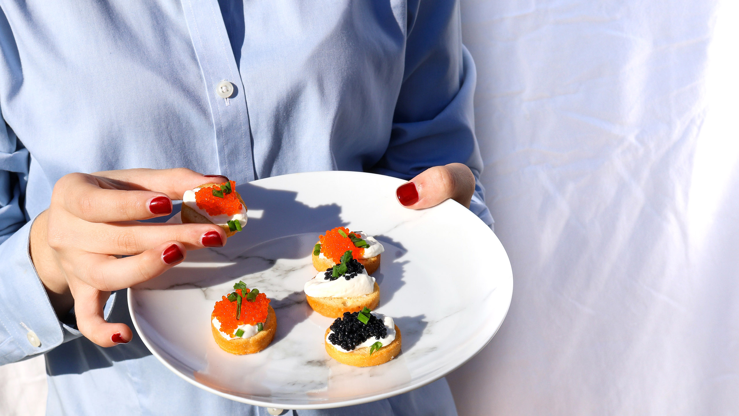
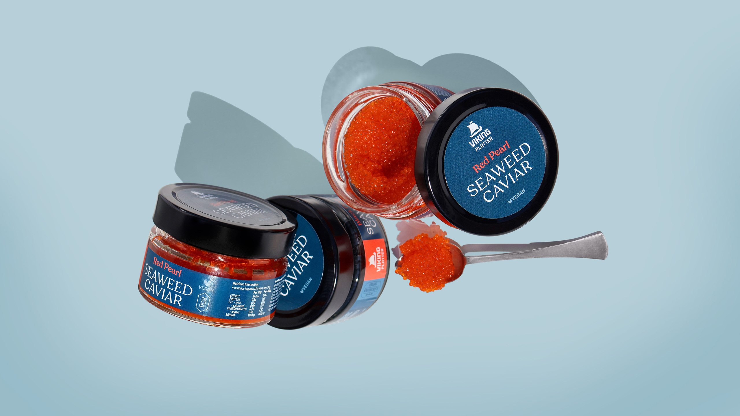
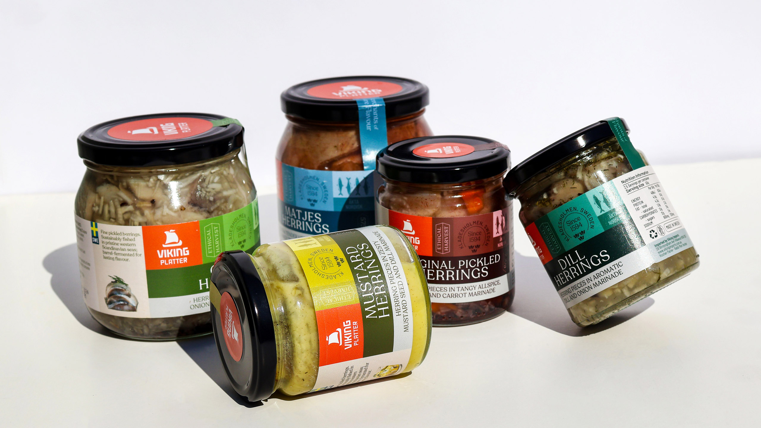
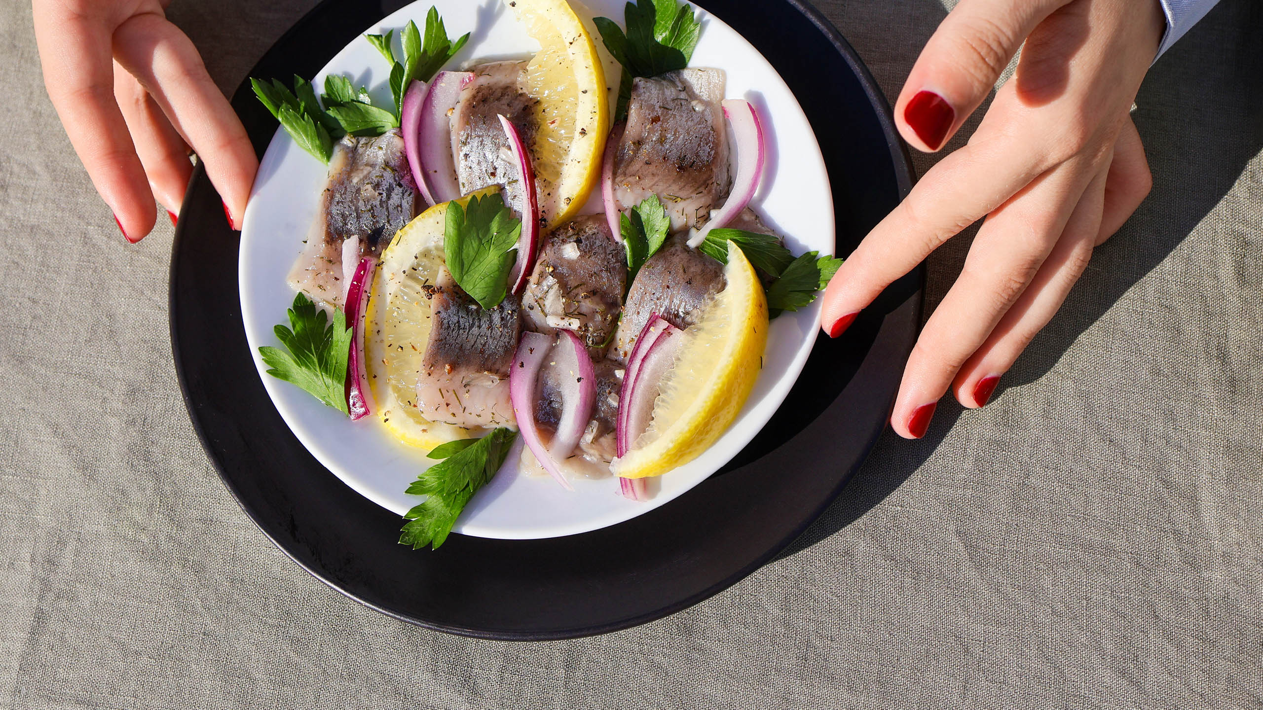
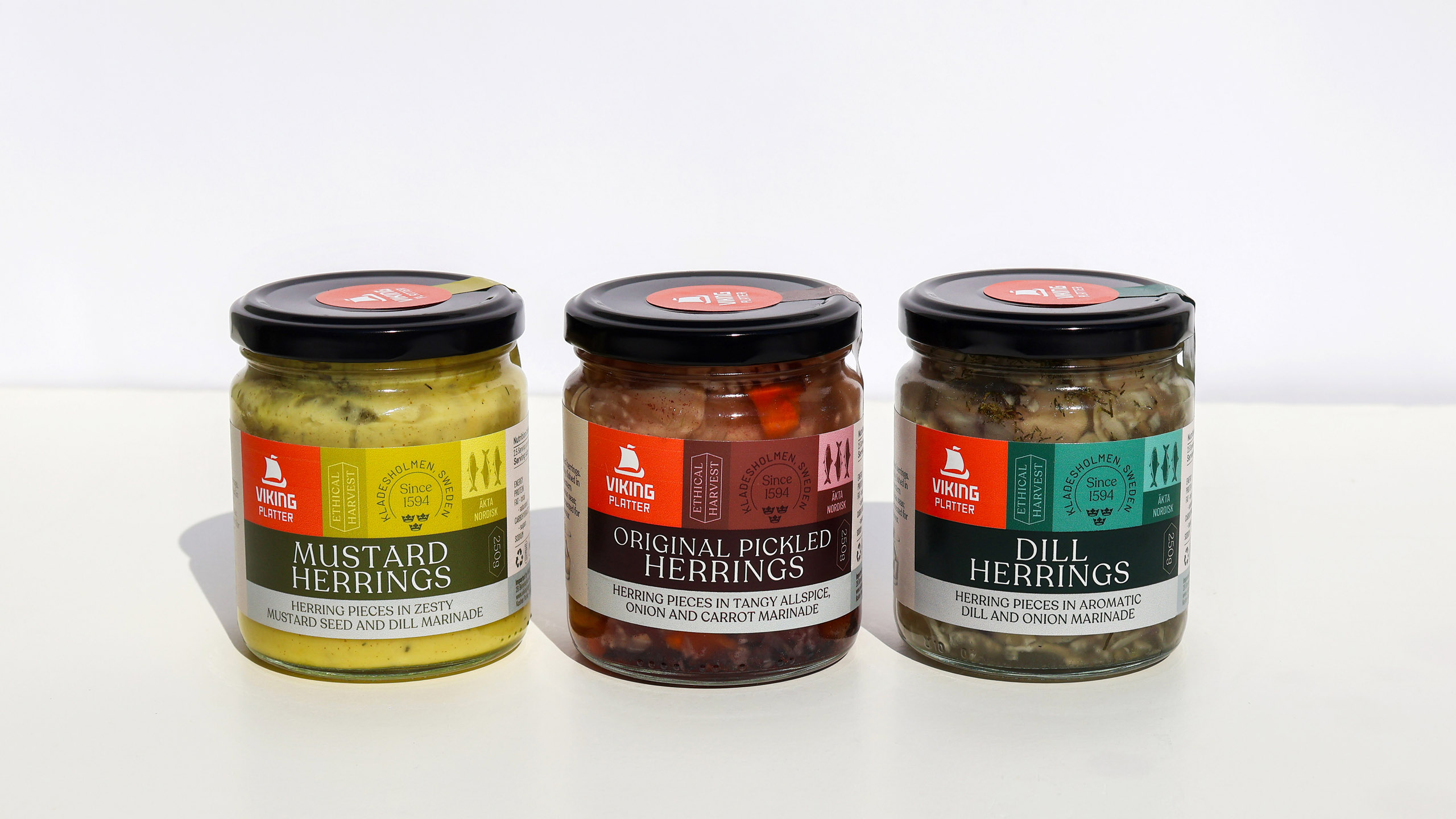
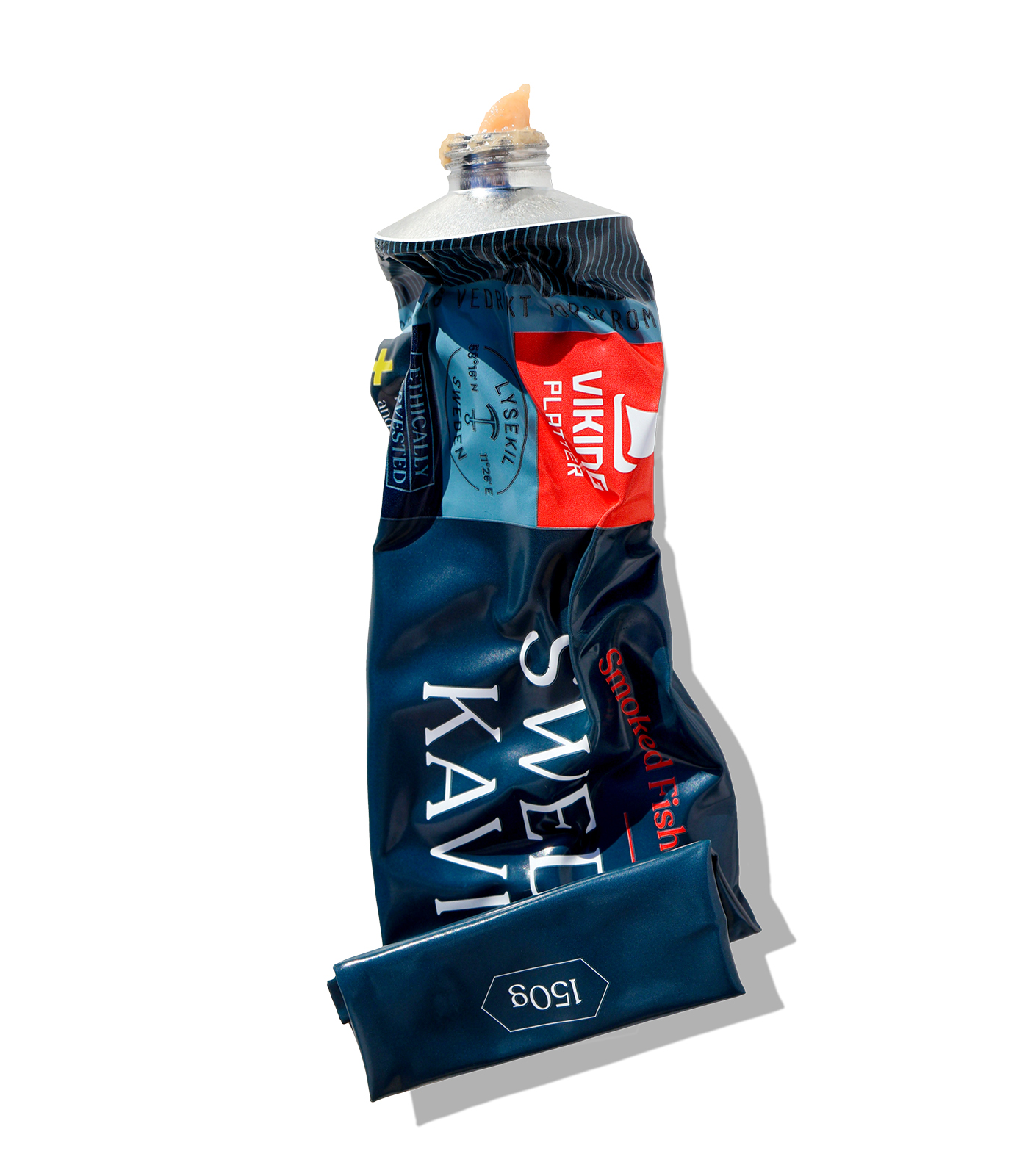
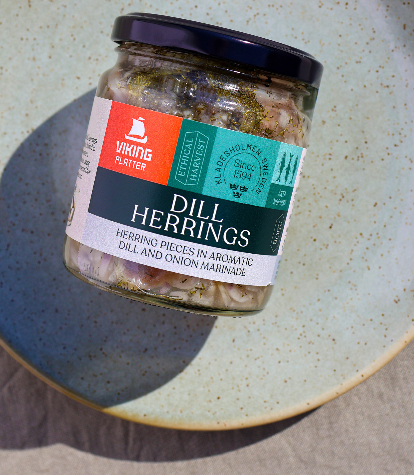
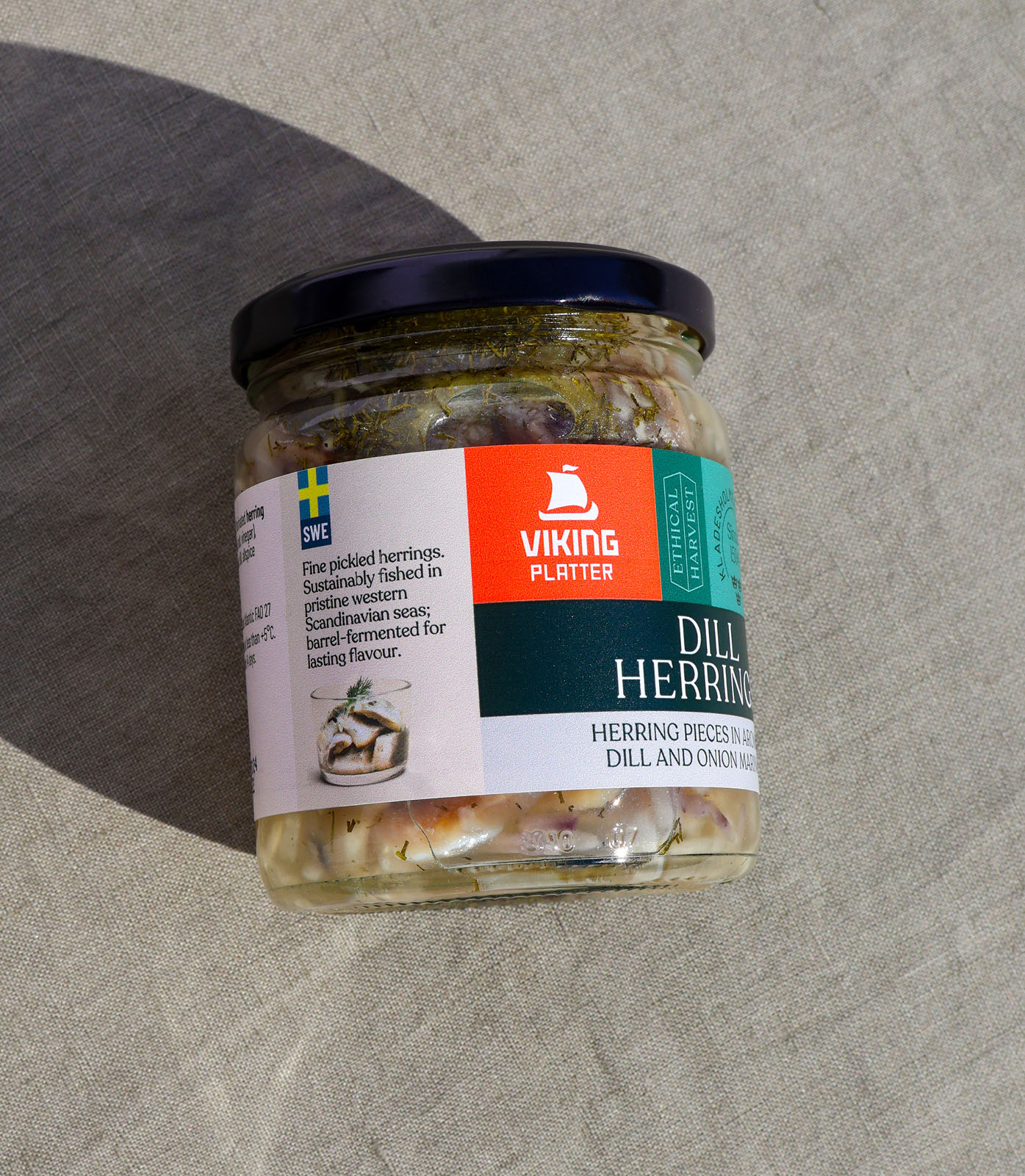
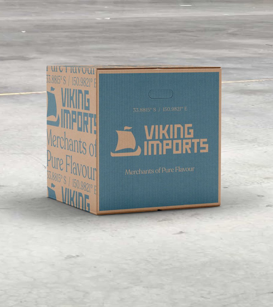
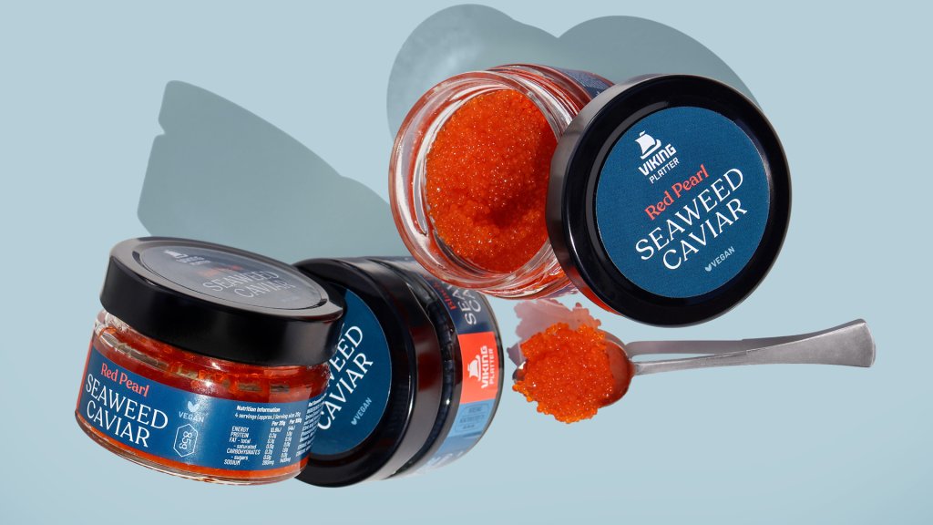
Back in 2020, we completed an extensive rebrand for Viking Imports. This always included a vision for how the packaging for its various products would look. First in market is this packaging redesign, for a collection of authentic Scandinavian seafoods by sub brand Viking Platter.
Säg Hej! Scandinavian Seafood for Sophisticated Diners
Read more
Brand recognition is a critical part of Viking Imports’ journey as it continues to expand across Australia. This growth in turn is thanks to the company’s track-record. Viking has a reputation for sourcing clean, healthy and delicious foods from around the globe for everyday use.
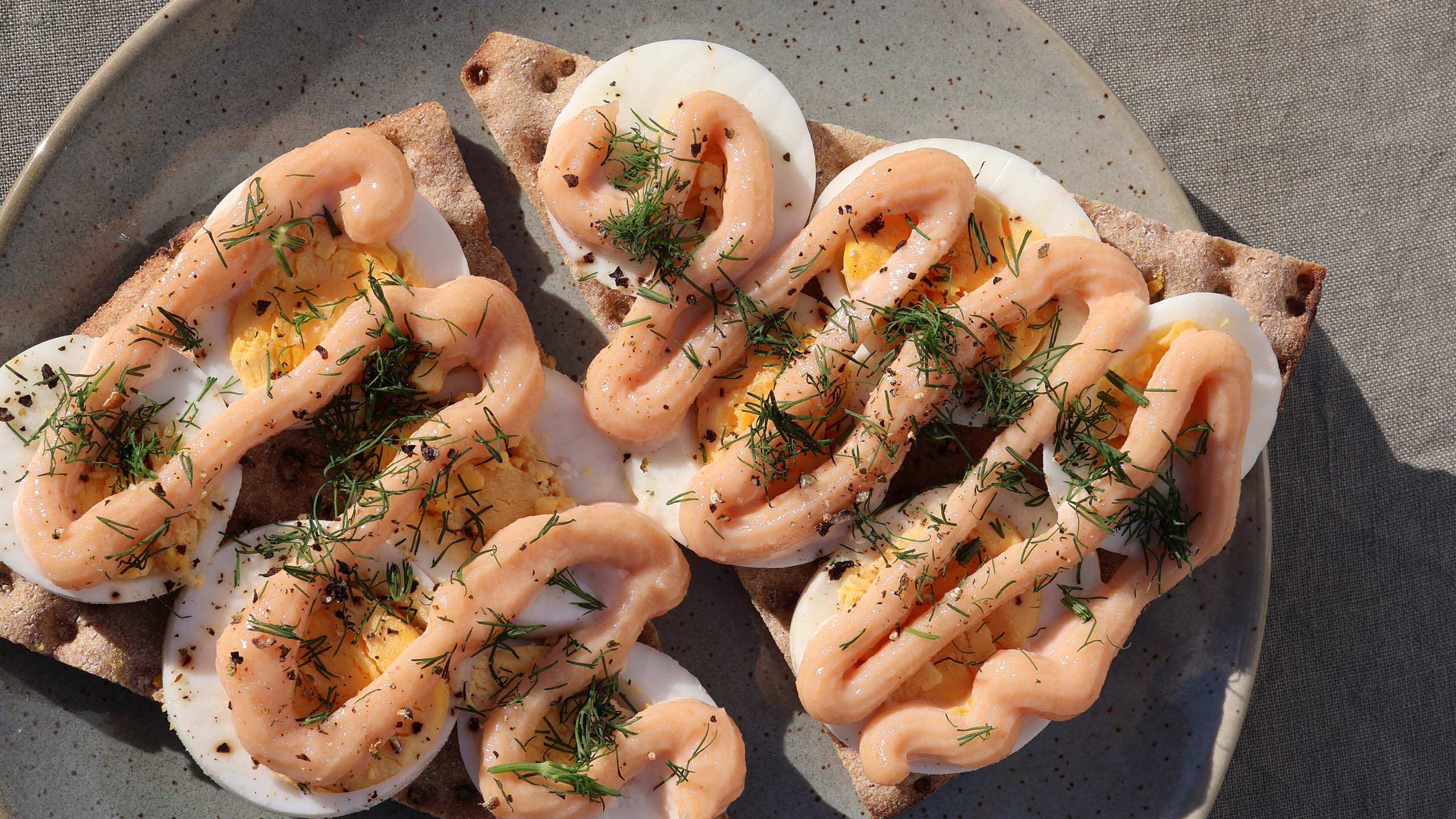
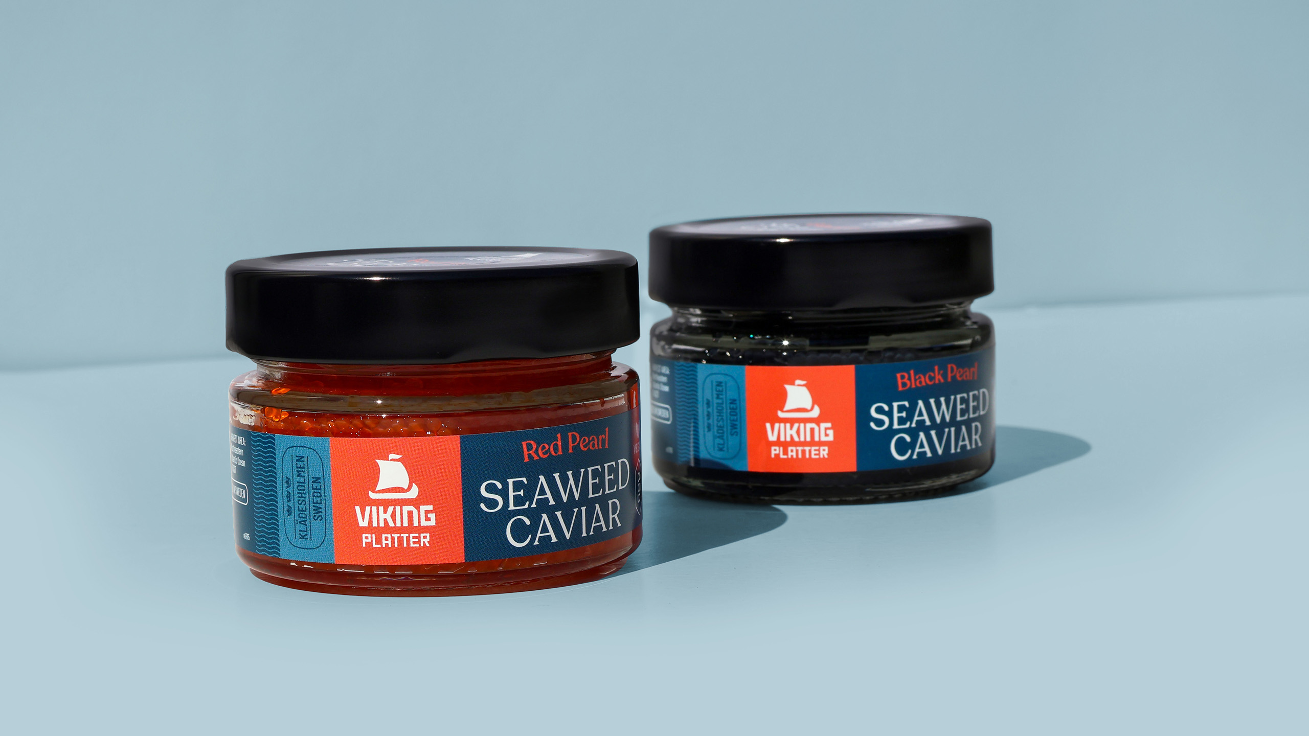
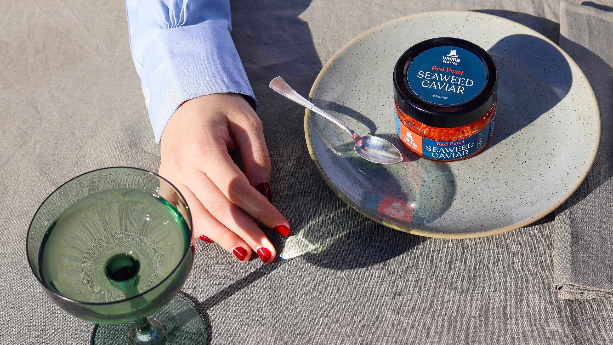
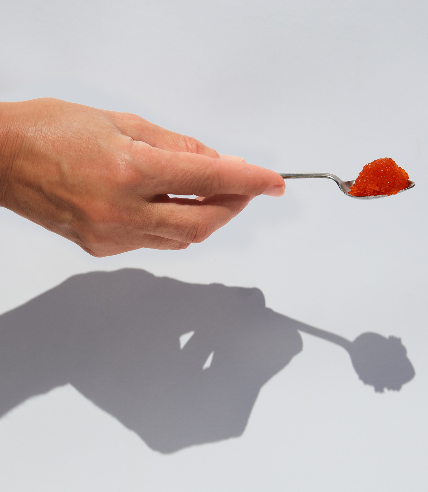
Our packaging redesign for the seafood collection is rolled out across six varieties of pickled herring, two flavours of seaweed caviar and a select cod roe crème. Two criteria were defined as being particularly important for project success:
- Achieve a more premium shelf presence, reflecting the product’s high quality and sustainable sourcing.
- Help customers distinguish more easily between the flavours at the point of purchase.
Our colour-blocked concept achieves these objectives using several elements. The writing celebrates each product’s authenticity and taste, while a logical system of graphics and colours distinguishes the flavours. Similar brand assets will also feature on other Viking sub brands and products, relaunching soon.
Since the packaging relaunch, Viking Platter’s collection Scandinavian seafoods have been increasingly ranged at Australia’s most discerning retailers. Stores that previously questioned whether the product met their customer profile now carry several lines. Sales are increasing as well.
We’re pleased that our packaging is helping to boost perception of such a distinctive and high-quality product.
