Pat and Stick’s Ice Cream Co is arguably Australia’s greatest maker of the old-school ice cream sandwich. Since launching in 2004, their brand platform has always been about quality and realness. This was one reason why Pat and Stick’s helped redefine the market for deluxe impulse ice creams, one freezer at a time, in gourmet retailers across the country.
Premium Australian Ice Cream
A refreshed brand strategy, voice and visual identity for beloved Australian brand, Pat and Stick’s Ice Cream Co
Read more
Fast-forward almost 15 years, and the single-serve ice cream market has transformed. More boutique competitors fill more niches that didn’t exist then, and several big-name brands have muscled in on the ice cream sandwich territory. (Although if you’ve tried any, you’ll agree they are awful).
At the same time, we are seeing the worldwide rise of the experiential brand. Customers care as much about a brand’s backstory as they do about its qualities.
We were delighted for the opportunity to refresh the brand we had built up over so many years, and which now included so many new products and customer touchpoints.
After kickstarting the project with market research and a strategy workshop, we discovered that the Pat and Stick’s artisan quality was a given to their core customer, whom we nicknamed Resident Foodie. What these customers didn’t know enough about – and wanted to know more of – was the brand’s Australian heritage and big personality.
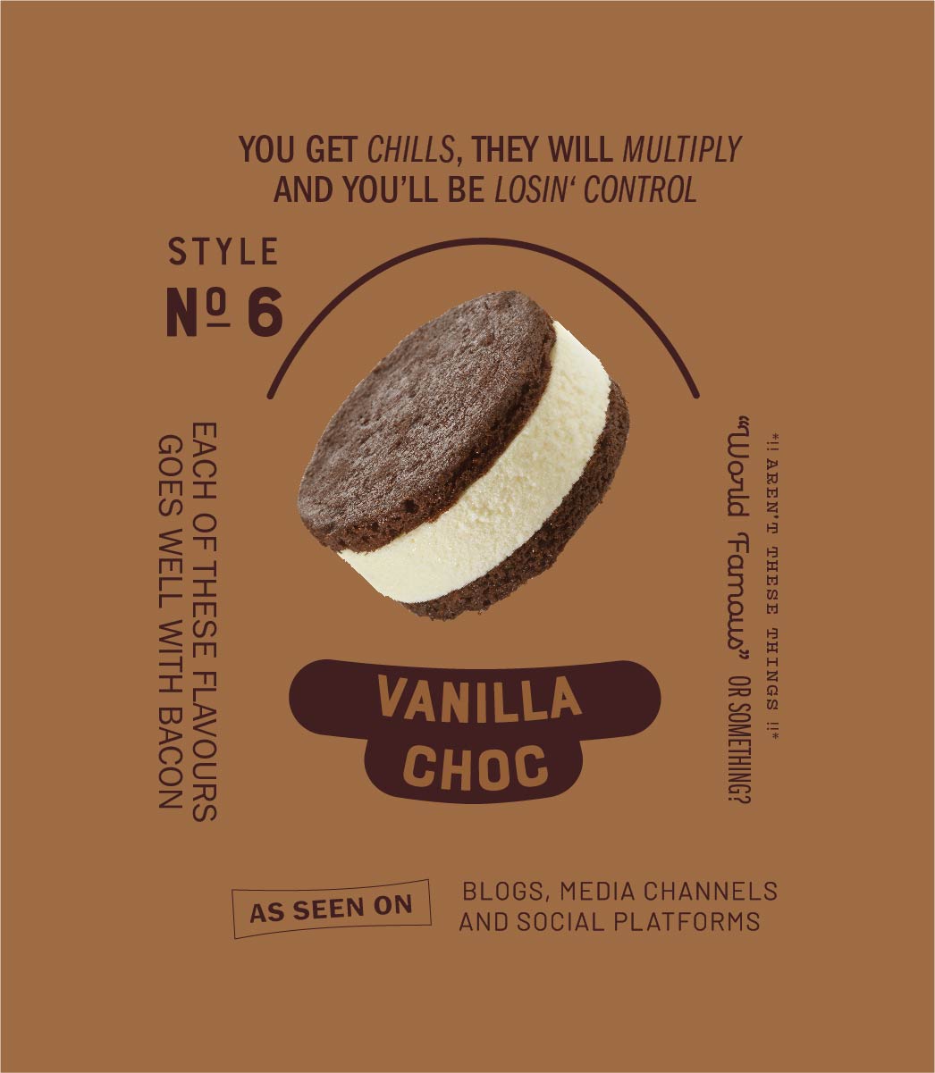
We created the positioning statement ‘Pure Enjoyment’ and a new brand language to spearhead a whole new set of creative, designed to connect directly with this customer. Fun-loving and the hubs of their personal circles, Resident Foodies are passionate about good food without being snobby.
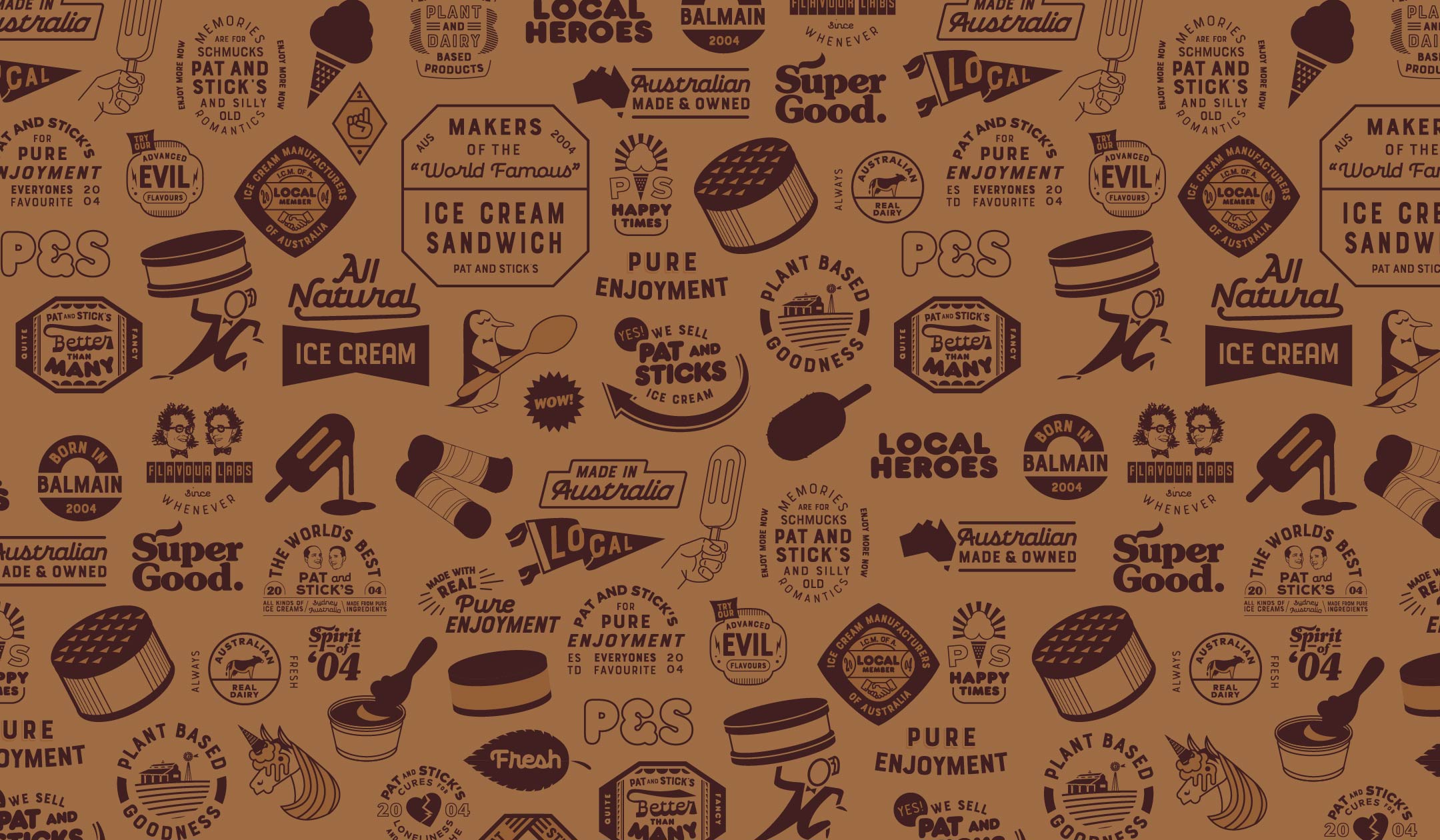
They’re also born storytellers, and we wanted this customer to have plenty to talk about when sharing Pat and Stick’s with their friends. The brand language features in an extensive set of illustrated memes as part of the rebrand, which make cheeky references to everything from cult films and pop music to unicorns and paleo diets.
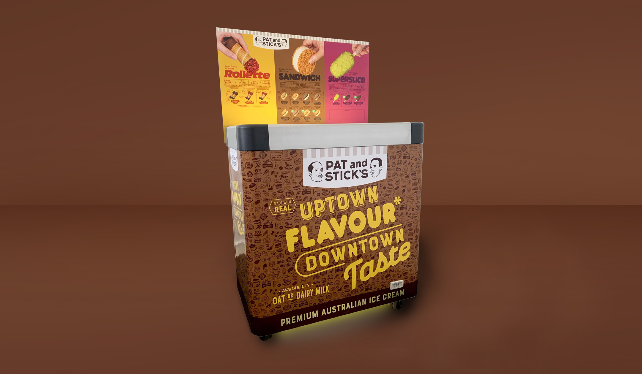
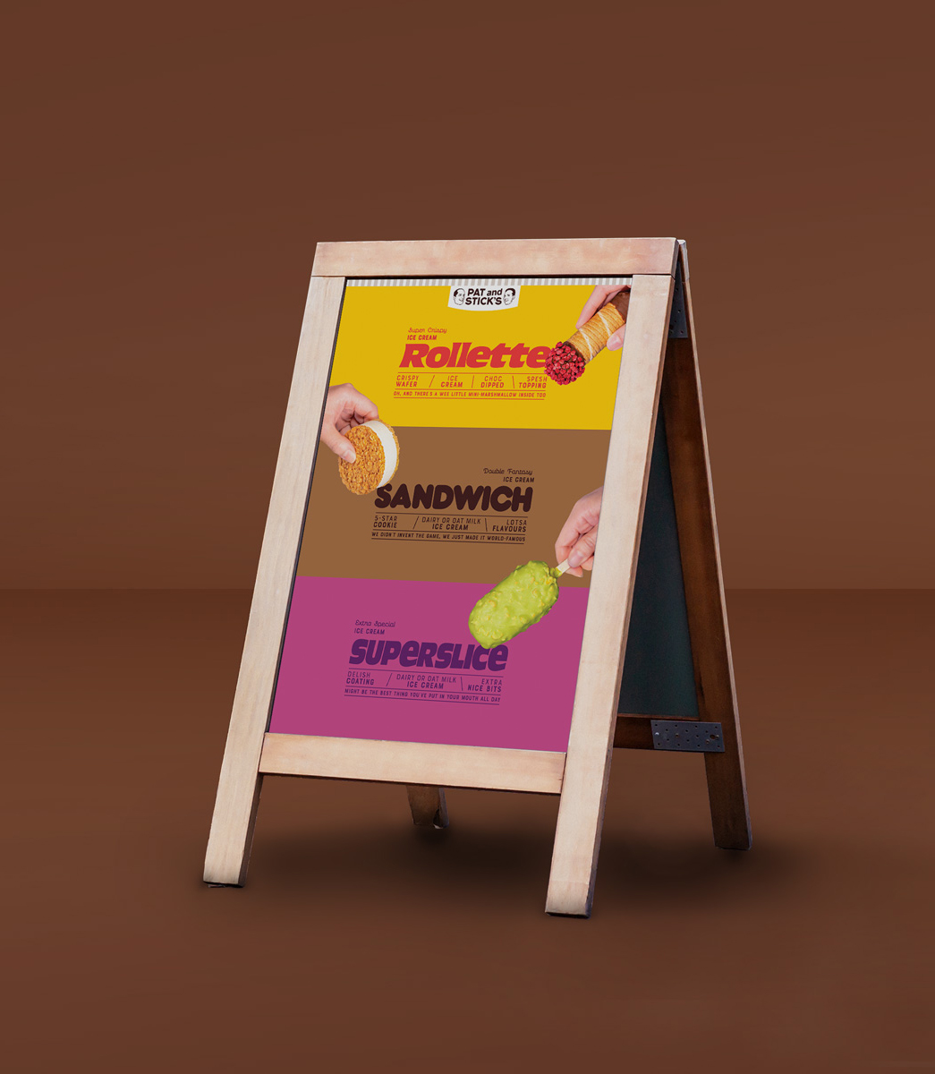
The graphics are emblazoned across all consumer touchpoints, especially the branded freezers and menu boards – still a core part of the Pat and Stick’s retail strategy. The freezer and menu invites customers to engage with the brand in-store while taking their time deciding which flavour to buy.
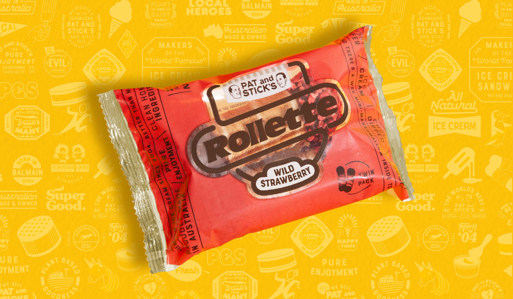
Our brand refresh for Pat and Stick’s also includes a simplified logo for easier application across digital platforms, ensuring recognisability at any scale. The iconic Pat and Stick’s brand stripes have been pared back as a subtle awning lockup, allowing for greater design flexibility across new product packaging.
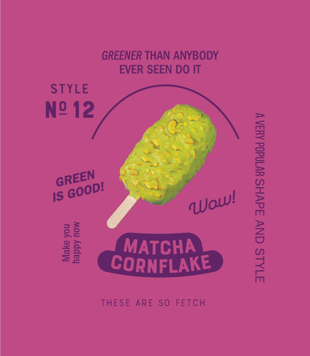
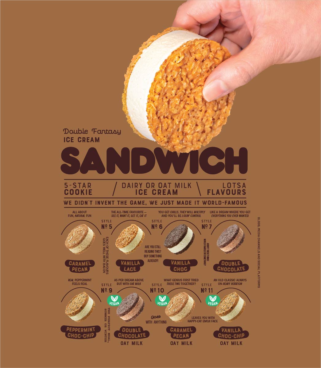
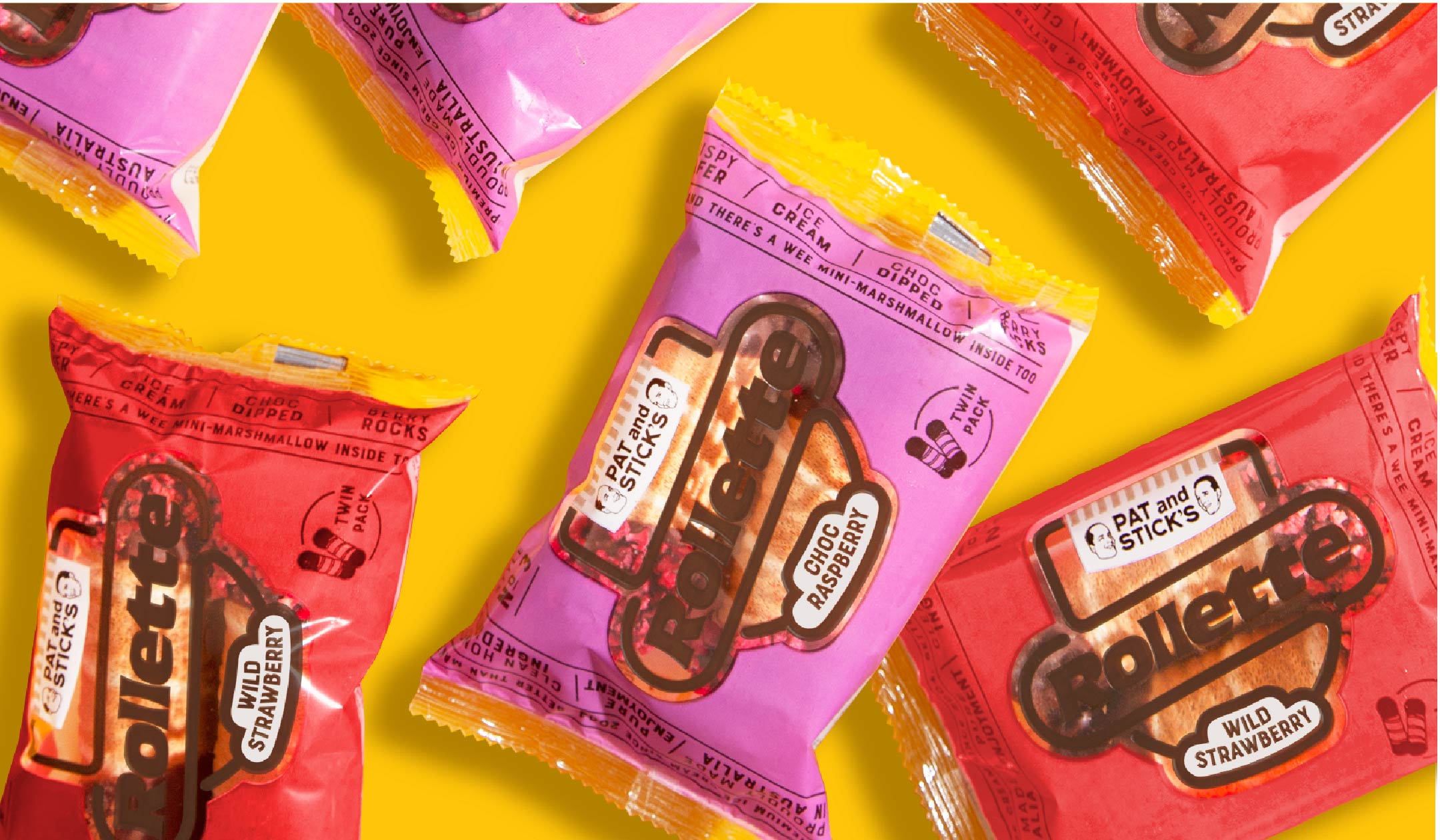
The latter includes an oat milk-based vegan ice cream collection, Rollette frozen cannolis and Superslice ice cream bars, all launched in late 2020 and early 2021.